Why: To support ATO staff conduct reporting statistics
Activities: Stakeholder Discussions, Prototyping, User Testing, UI Design
Tools: Axure, iPad Pro
Role: UX/UI Design
The situation
Statistics and reporting
Staff had needed a method view at a glance meaningful statistics, and download reports reflecting the statistics.
The task
Create a widget
I was asked to design a dashboard widget that would be able to present a range of options to select from, display statistics for comparison numerically and statistically, and to provide a download option of the data selected.
The action
Requirements
I met with the SME to understand the statistics that would be retrievable from the system via API.
These notes formed the basis of the requirements for the widget.
I converted the requirements into individual mockups to present back to the SME to confirm understanding.
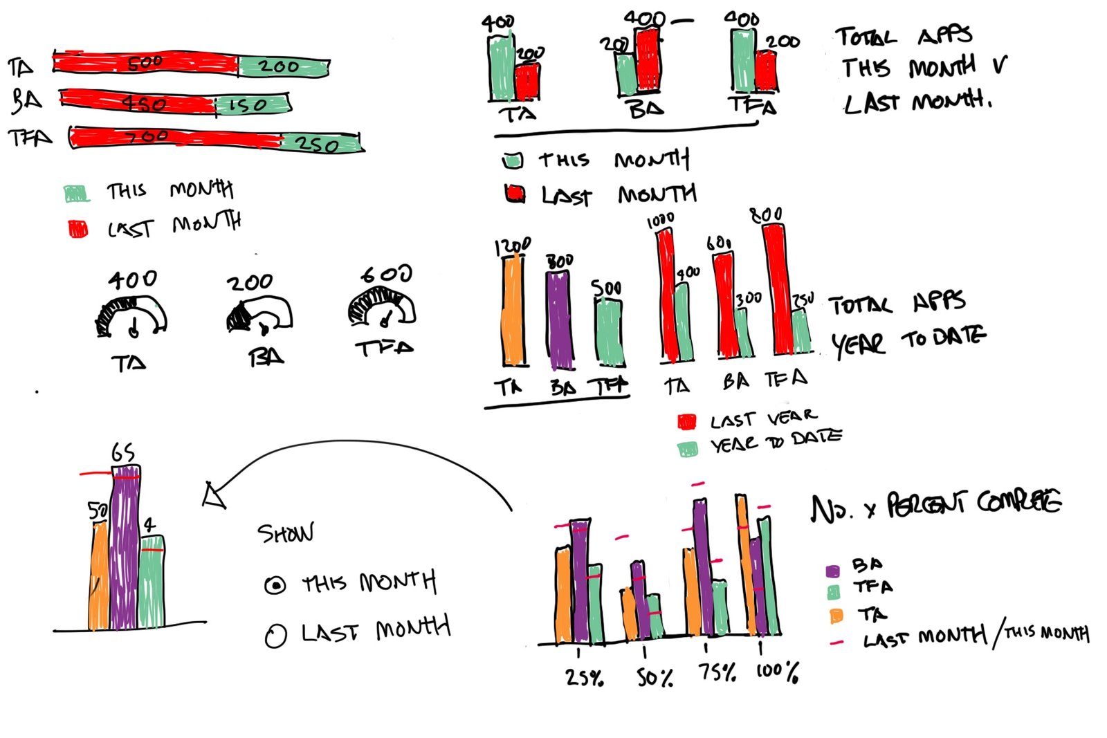
Sketching
Using an iPad Pro (and a coffee), I began to sketch and explore what the widget might look like.
Prototyping
Synthesizing the feedback from discussions with the SME (and PO), I did some further designs on each of the required data types.
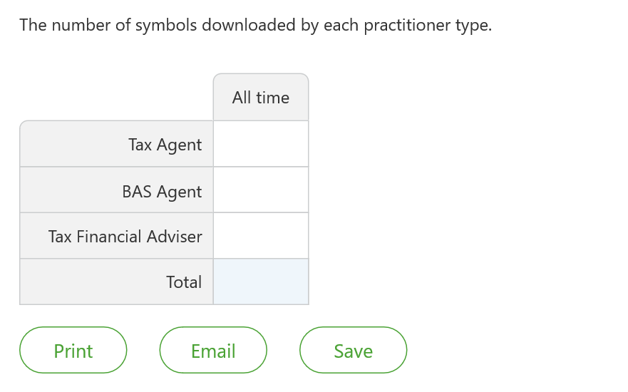
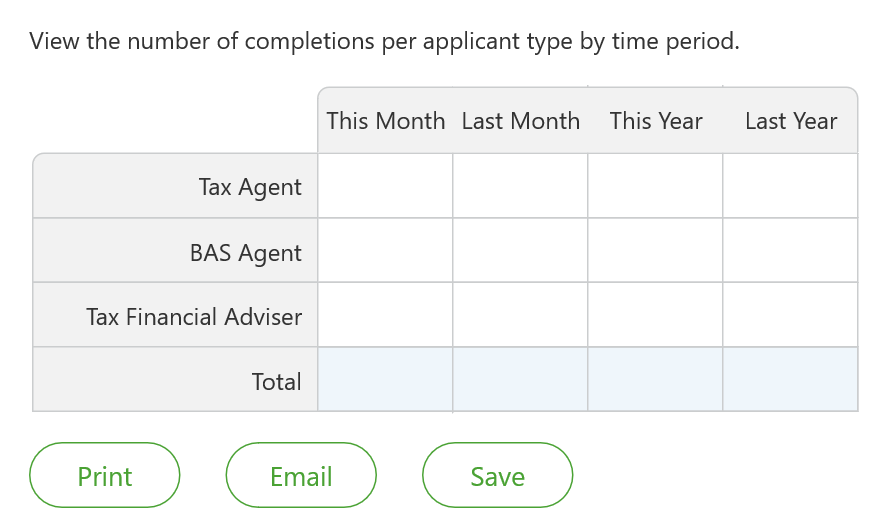
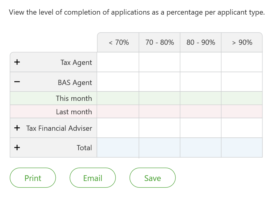
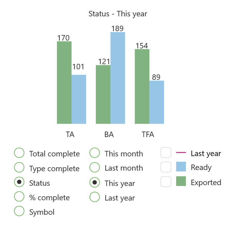
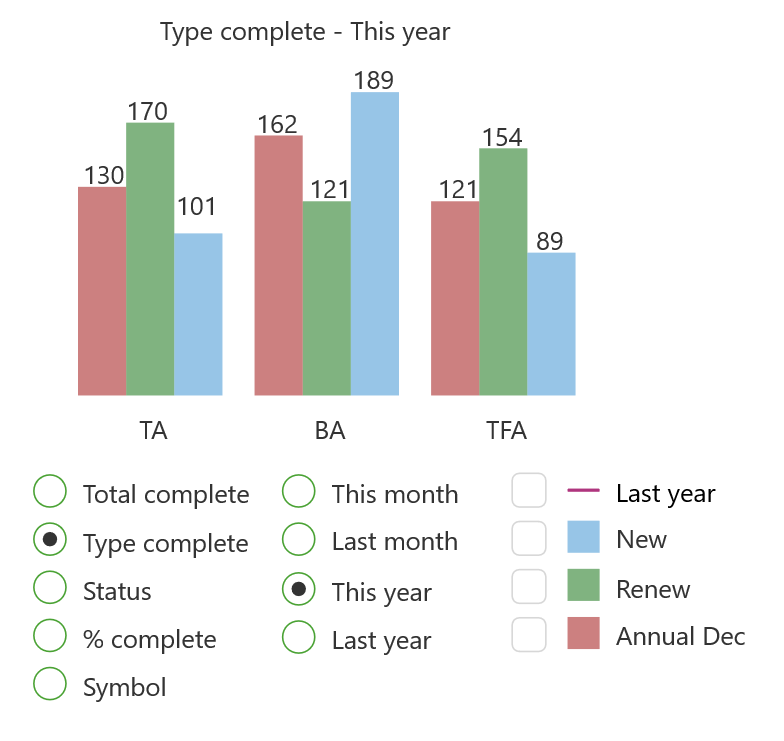
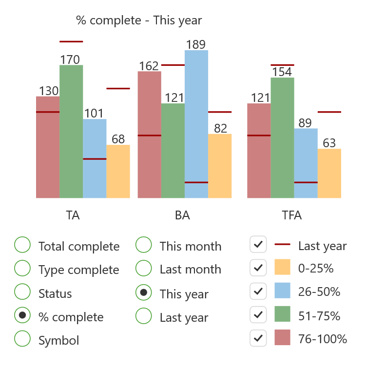
The result
The final design
The final widget design combines the various screens into a single display. It does this by allowing for filtering by a range of criteria, selecting multiple options of the criteria selected, then selecting a given time period. The selected data can then be exported in PDF or Excel format.

