Product: Generic product sign-up flow for use across multiple products
Why: To increase efficiencies in design
Activities: Stakeholder Discussions, Personas, Scenarios, Prototyping, User Testing, UI Design
Tools: Adobe XD
Role: UX/UI Design
The situation
Fragmented experiences
Equifax had a range of products designed independently of any single design system. While the requirements of onboarding across multiple products were very similar, the design was varied and did not provide a cohesive experience between products.
The task
Streamline design
Develop a series of generic onboarding flows fellow UX designers are able to leverage in order to:
speed up design
contribute to a cohesive design experience across products, and
contribute to customer retention and business reputation.
The action
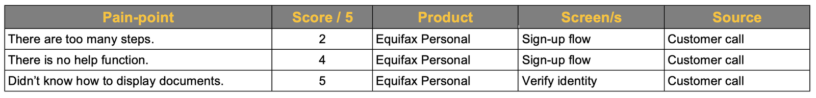
pain-points
First, I met with stakeholders to identify products across Equifax that included a signup flow.
I then reached out to the support team to understand the type of pain-points customers had mentioned during phone calls.
Each pain-point was reviewed and given a score out of 5. This assisted to highlight the worst of the pain-points.
Function mapping
I analysed the task flow of each sign-up flow then recorded all of the functions for each, e.g.
create username
create password
login
enter personal details
enter identification details
etc.
I then mapped out each dot point/function to their respective screens to provide a high level descriptive task flow capturing the requirements of all task flows in one.
Wireframes
I used the high level descriptive task flows to create wireframes.
USer testing
Moderated user testing was carried out to get feedback on the layout, flow and functionality. Feedback was considered and integrated into the design as appropriate.
UI design
Using the Equifax design system, I then created hi-fidelity screens. Where design patterns required were not in the design system, I submitted the newly design component for inclusion in the design system.
Pain-point check
The pain-points were checked off – verifying they were addressed in the new design.
Sign-off
For the sign-off presentation, senior stakeholders were presented with step-by-step paper prototypes of the designs. This allowed for any last minute design suggestions (while noting the designs are generic in nature).
Handover
The screens were then placed in tables as task flows (along with the working file) which described:
user story (trigger, activity, goal)
screen name
screen purpose
functionality on the screen
mobile screens
tablet screens, and
desktop screens.
This ensures developers and other stakeholders have a clear understanding of the design and functionality.
The result
Time saved
The final design allowed the UX team to streamline their work and focus on the core product elements instead of the onboarding. Furthermore, it gave back time to developers, and they also were able to significantly reduce the amount of code required because of the new commonality between products.


